WELLNESS ON YOUR WAVELENGTH
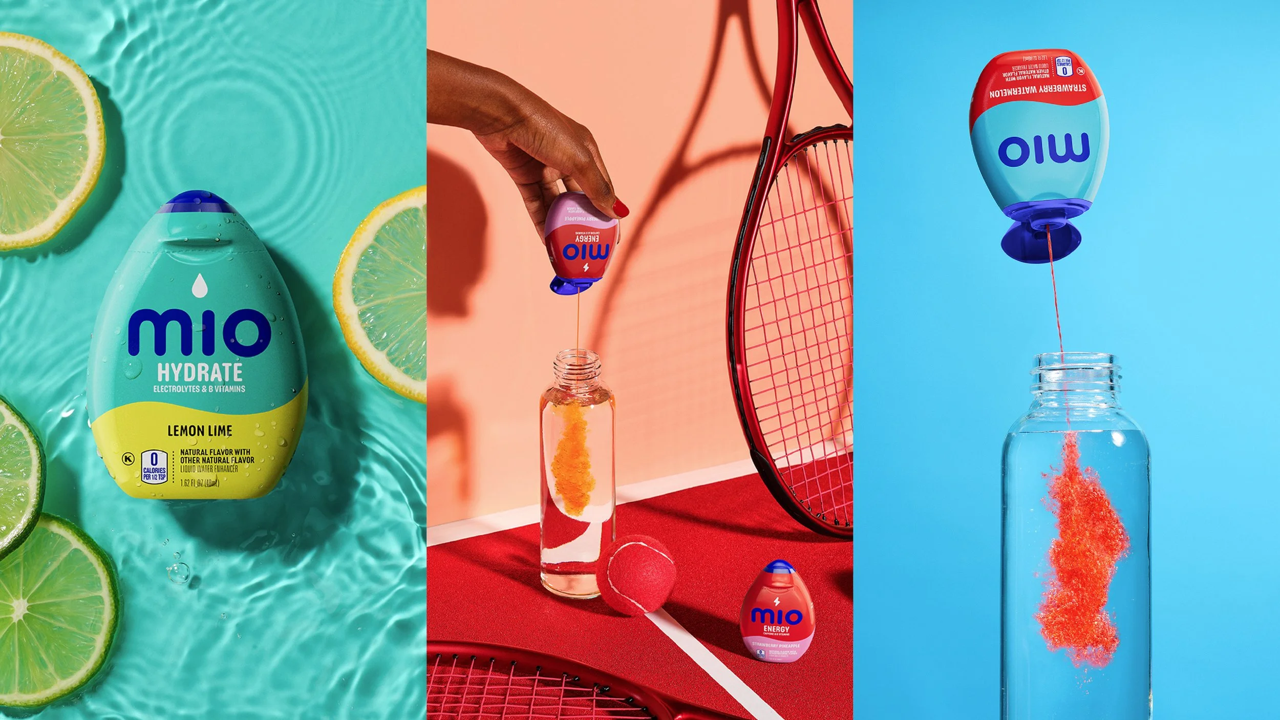
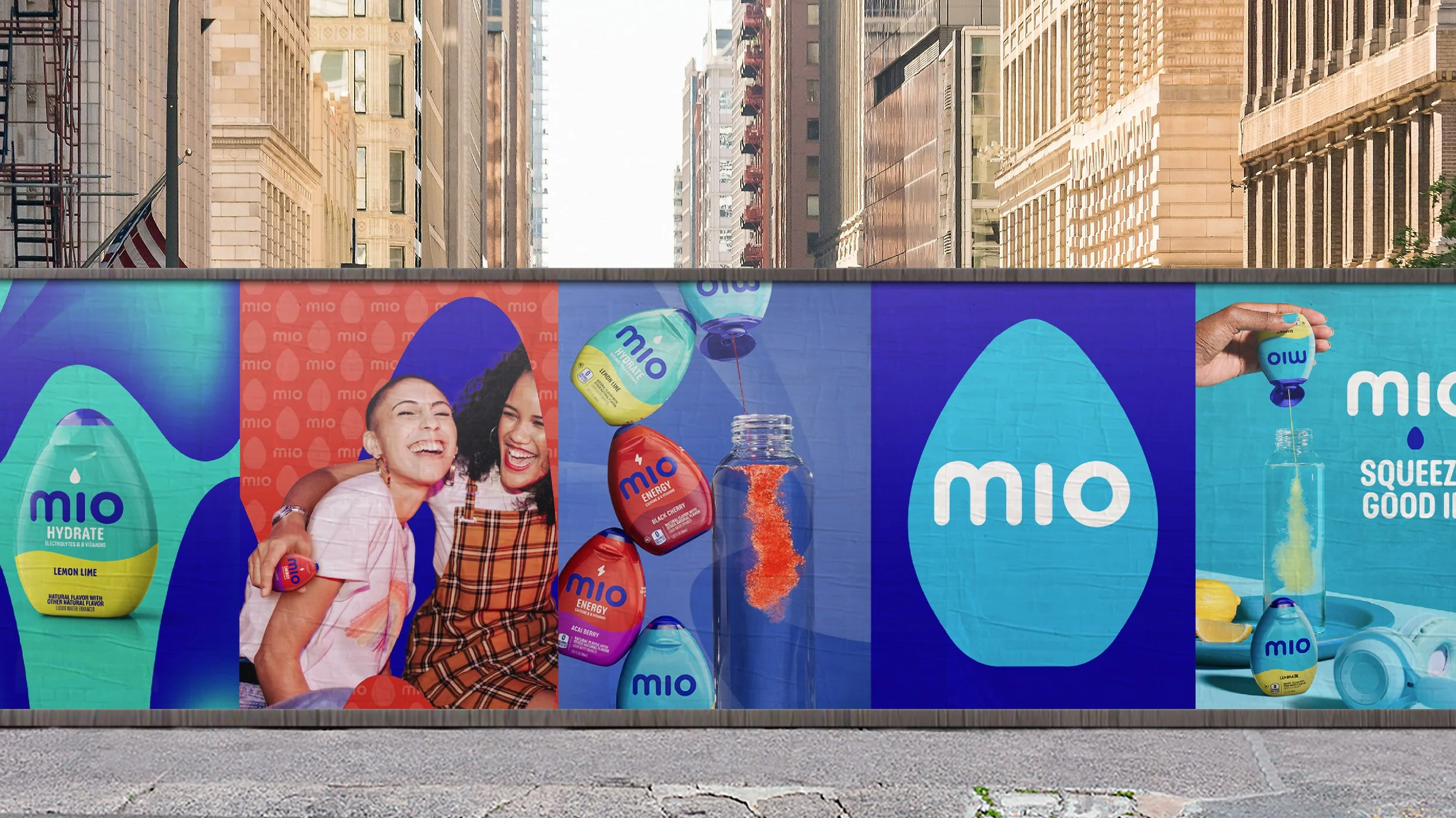
Shifting away from a product that helps to ‘fix water’, mio’s refreshed look and feel is the first step on a multi-year journey to target the Gen-Z audience and show them that through mio, wellness is accessible, easy and can be personalized to meet their needs.
task
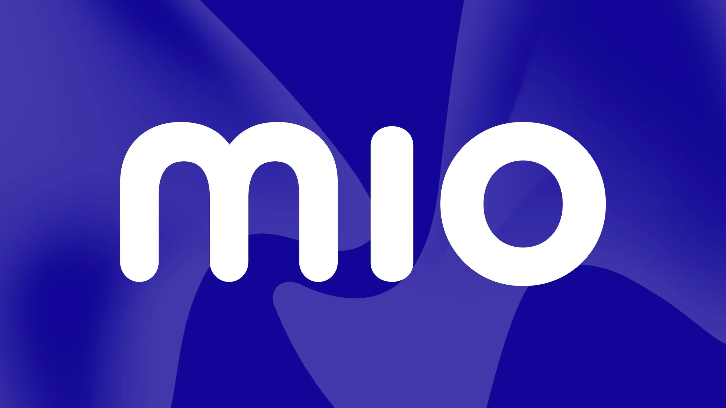
The new brand identity expresses the fluency that mio’s audience wants and expects from their wellness, starting with the new logo. The logo’s soft and rounded font is complemented by the wave-like split of colors across the product packaging – and is a consistent presence across the rest of the brand world through the implementation of the wave pattern, created as a new distinctive asset across all touchpoints.